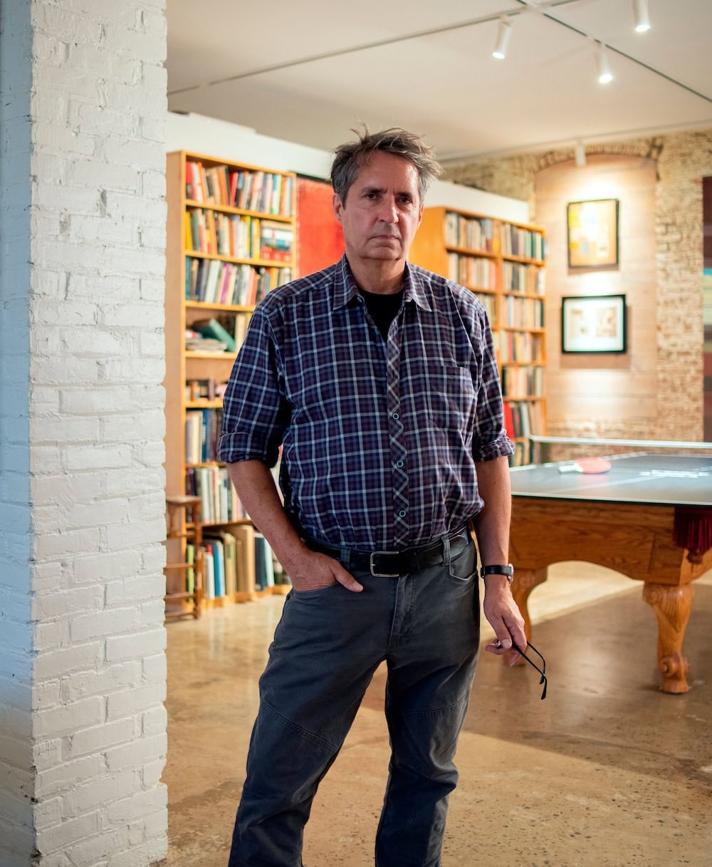
Interview: Miles Aldridge on ‘Doors’
To accompany our online exhibition, ‘Miles Aldridge: Doors’, we caught up with the photographer on the making of his latest series. Drawing inspiration from great sculptors like Michelangelo, Bernini, and pop artists like Andy Warhol, Aldridge explains his laborious but rewarding screenprinting process. Conceptually, Aldridge continues his cinematic exploration for truth amongst surface appearances, nodding to filmmakers Alfred Hitchcock and David Lynch along the way.
SOL:
Tell us about the concept, what’s happening in ‘Doors’?
MA:
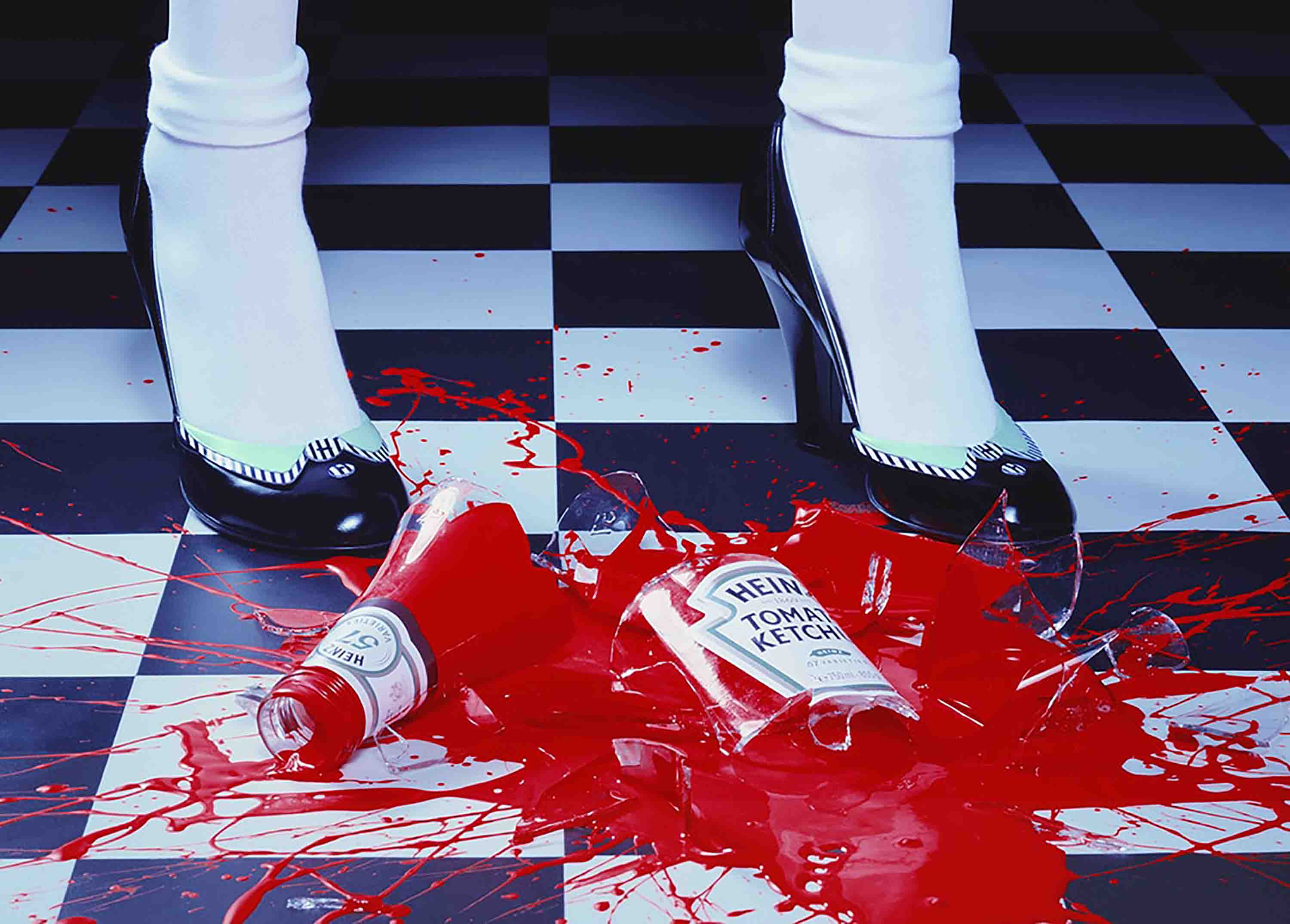
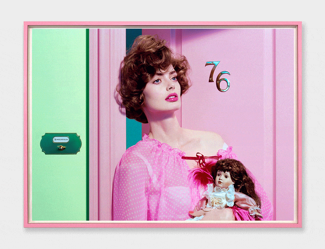
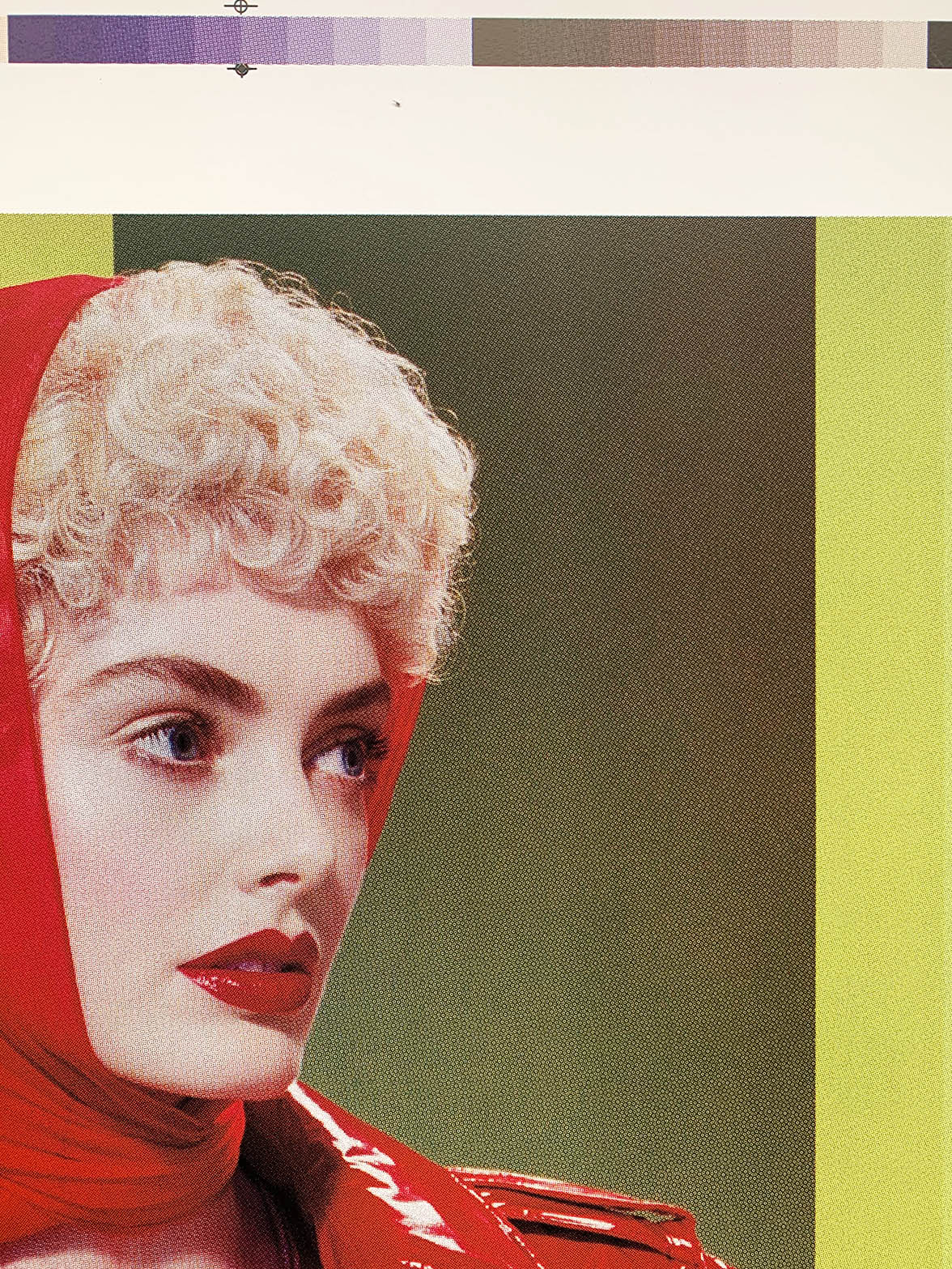
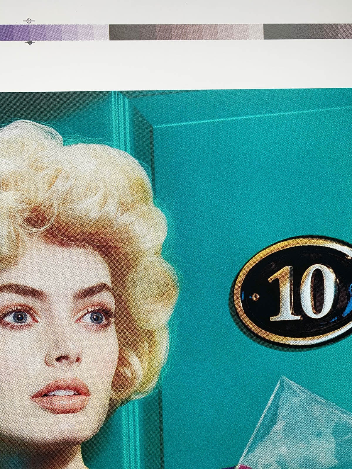
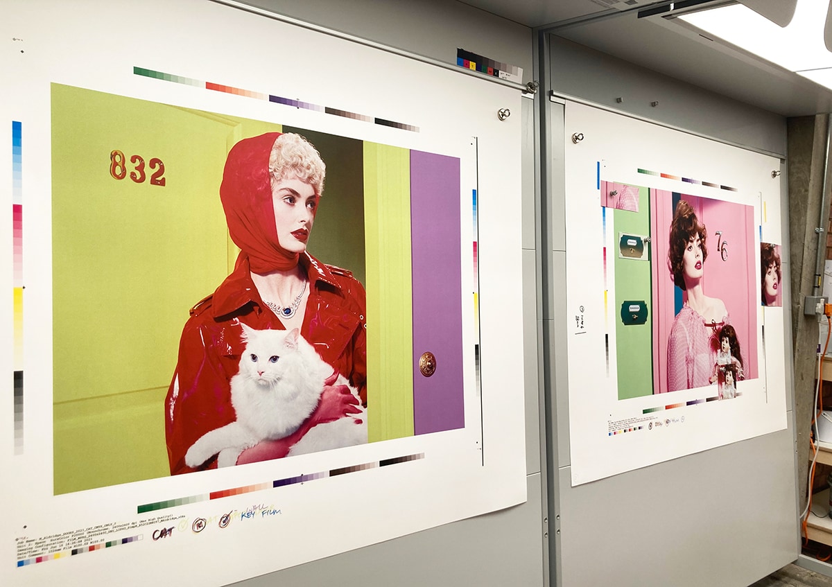
I landed on the idea of women coming through doors, as a kind of metaphor for entering and exiting life. I played with a number of everyday scenarios, such as taking the cat out, receiving flowers, bringing in the shopping, or just that feeling of apprehension when someone knocks at the door and you don’t know who it is. I like the tight cropping that only features the model and a prop in the frame, along with a bit of wall and a door. While these works are quite controlled in a compositional sense, they started to become rather abstract to me, as this regimented cropping allowed me to experiment more with colour. ‘Doors’ is probably my most abstract work to date, because, in a way, colour became the subject more than anything else.
SOL:
How did you go about selecting the colours?
MA:
Selecting colour combinations is an intuitive and subjective process for me. There was no rhyme or reason, just whether or not it sings. The colours are almost perfect for each other, but are slightly off—just enough to keep you on your toes. Regardless of the quiet composition, they’re deliberately sharp images. I didn’t want the colours to be too harmonious, or to blend into the background. I wanted them to really speak; to have an abrasive edge.
SOL:
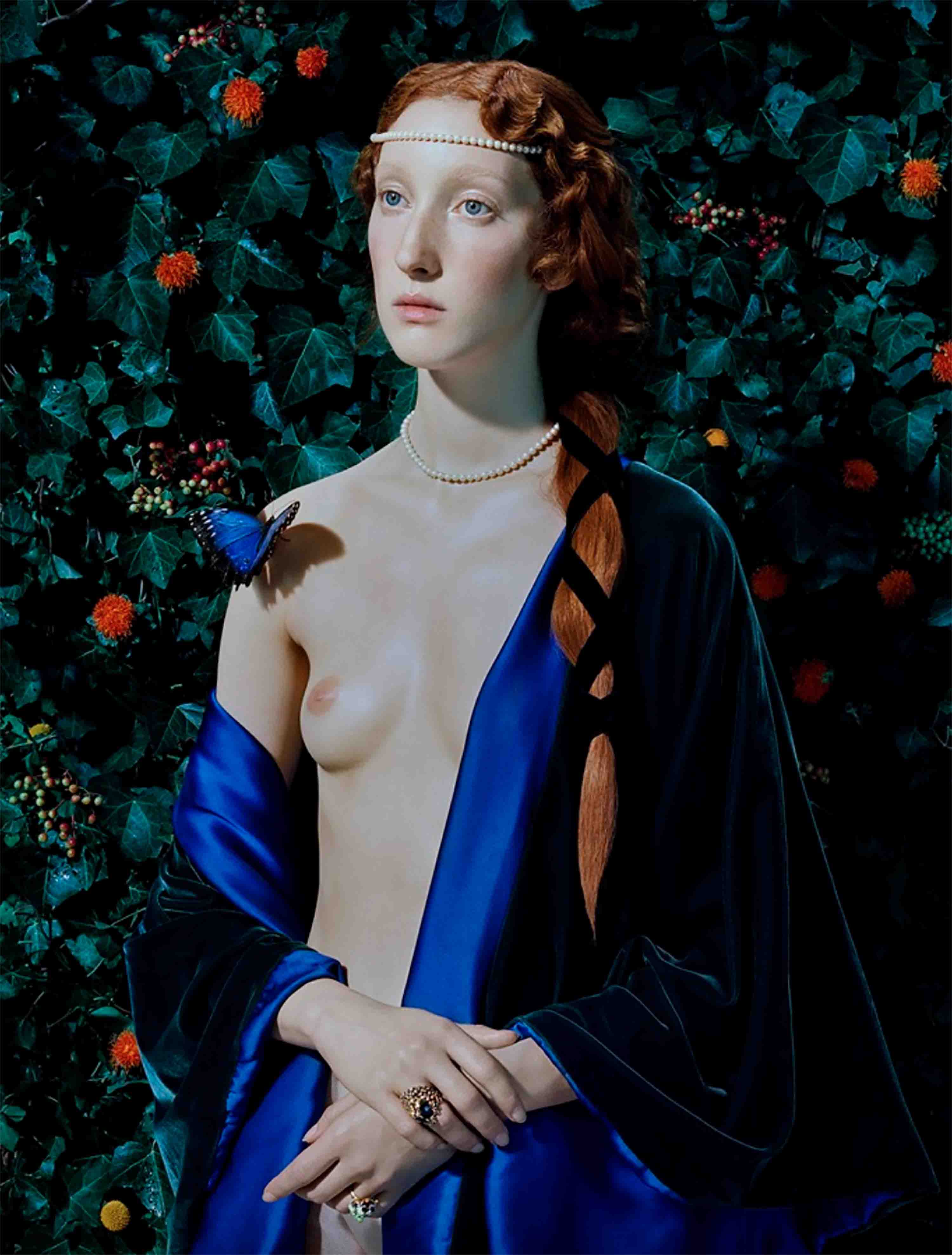
The door tag for ‘Doors #5’ reads ‘Madeline Valens’ – what inspired this name?
MA:
‘Madeline Valens’ is an homage to two cinematic female heroines of mine. ‘Madeline’ is one of the main characters in Alfred Hitchcock’s ‘Vertigo’ and Dorothy Valens is the protagonist in David Lynch’s ‘Blue Velvet’. They’re classic femme fatale characters but I’m especially drawn to the complexity of their fictional lives. Unlike your standard Hollywood beauty, these characters represent an admirable depth of character in imagination, madness and intensity.
SOL:
The same model appears as a series of different characters, can you tell us about the meaning behind this?
MA:
I’ve always liked the idea of using the same model in my series, but masquerading as different characters. It plays into the general philosophy of my work, which often explores the truth versus surface appearances. My work prompts questions like, ‘Who are we?’ and ‘Do we ever really know anyone?’ It plays on the idea that everyone might just be continually wearing a mask or costume (or a wig!), rather than being themselves. And if anyone is ever truly being themself, would we know?
For me, it’s imagination that makes us truly human. Our ability to fantasise is to live beyond the ‘real world’—what’s literally behind your door and out on the street. In the sanctuary of your home, you’re the truest version of yourself, while having the space and freedom to dream. When you leave this haven, you put on your mask or costume and you’re out in the banality of the world again; getting the bus, doing the shopping, walking the cat. So in this series, the door acts as a metaphor for the ambiguous space between imagination and reality.
SOL:
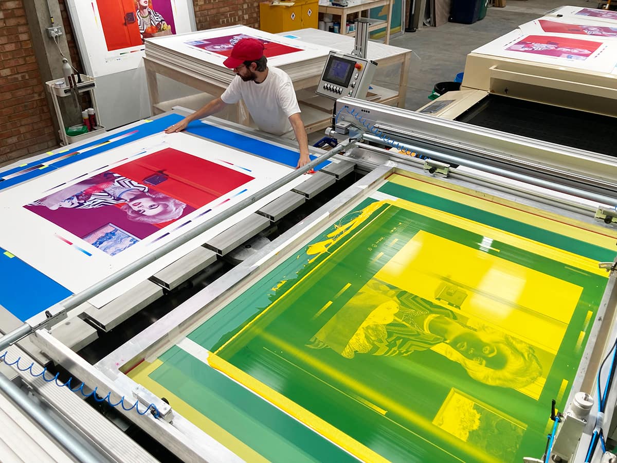
What inspired you to switch from making C-types to Screenprinting?
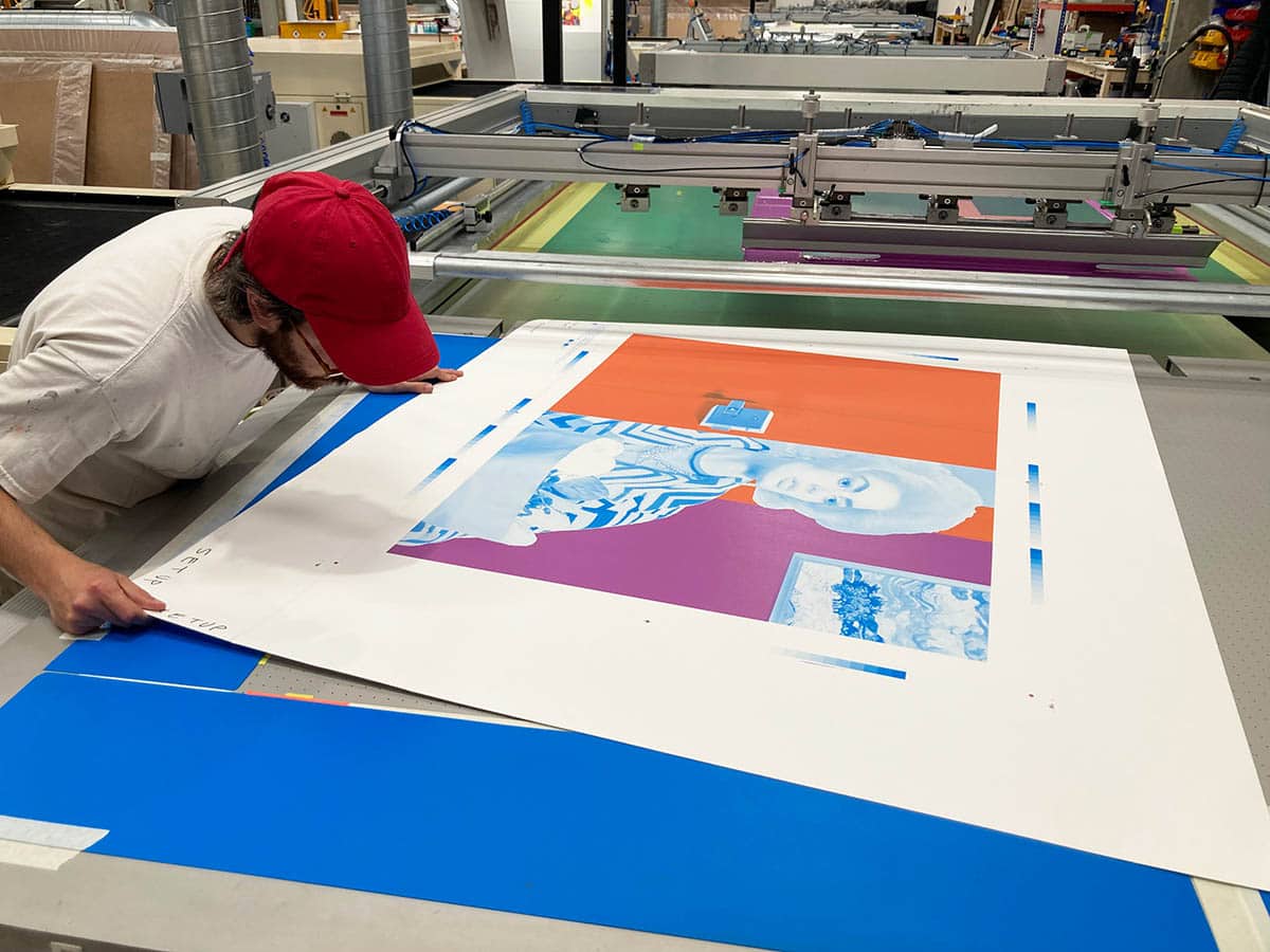
MA:
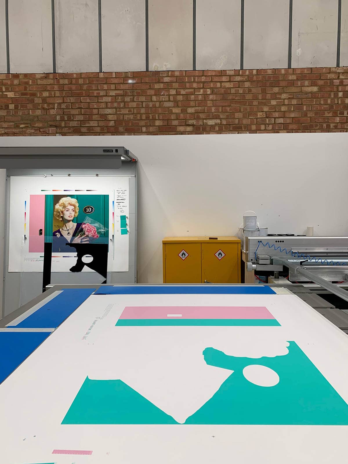
With C-type prints, all creativity is governed by the negative. So once you’ve got your exposure, you then proceed to make the print. But with screenprinting, the negative is just the beginning—you have much more freedom to play with the final image. You can break down the composition into different screens and colours and print them in various ways. In this case, all the doors and walls were printed first as pure blocks of colour that lie underneath the main image. I think the way those initial blocks of colour are melded into the full image is seamless. I personally think these prints are the most perfect things I’ve ever printed.
SOL:
What were you hoping to achieve with this process?
MA:
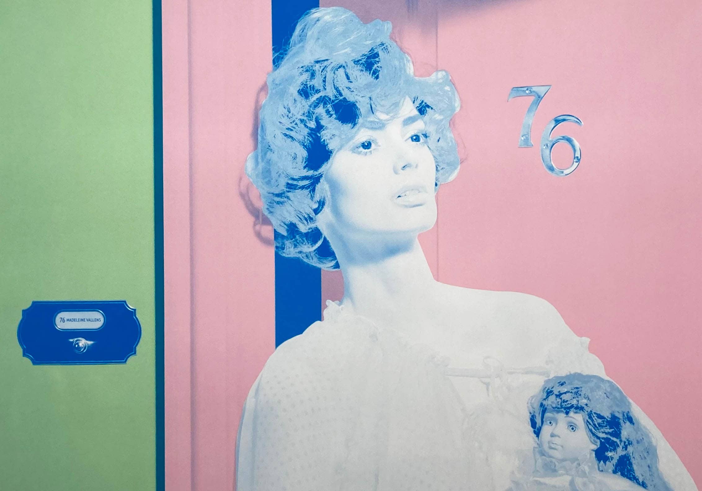
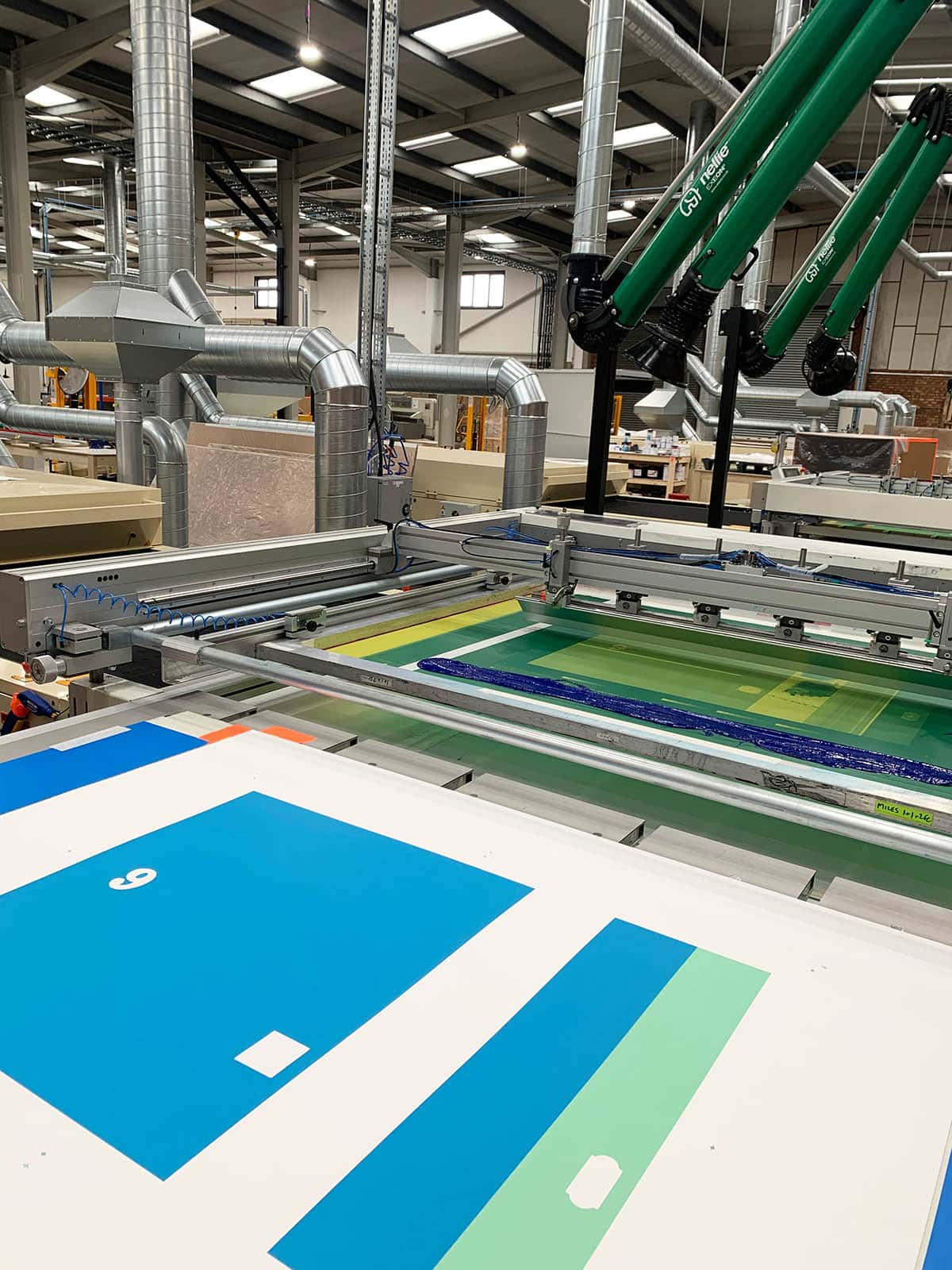
When people hear the word ‘screenprint’ they will likely think of Andy Warhol, perhaps of Marilyn Monroe or Elizabeth Taylor. A distinct lack of registration defines these famous works, as if Warhol enjoyed that parts of the image didn’t quite land where they should land. They are splotchy and ‘badly’ printed, but in a deliberate, self-knowing way. While these qualities make a great Warhol print, I wanted the opposite. I wanted perfect registration with no mistakes. Where Warhol celebrated the chaos that comes from screenprinting, with its accidental mark-making, I wanted the colours I imagined to be the colours I got. It’s a challenging process, but when you get everything to line up perfectly, it’s very rewarding.
Screenprinting is a true analogue process—squashing a squeegee with ink through a mesh onto watercolour paper. After repeating this process several times, you get an image which on the one hand is very photographic, but when viewed from afar, it looks a little like a painting because of its nuanced tonal range. Close up, you can see how the image is constructed through a myriad pattern of painted dots, which gives the work a pop-art, roughness.
SOL:
What is it that you love about the screen printing process?
MA:
For the past seven years now I’ve worked predominantly in screenprinting and my knowledge has really evolved. I’ve been focused on trying to conquer a very uncontrollable medium. I’m still amazed by the fact that you mix up tubs of bright, vivid ink, spread them with a paddle over paper, and the finished result is so perfectly rendered. It just doesn’t seem possible! Very few screenprints are also images of people—it’s really not designed to make portraits because it’s so hard to get flesh and skin tones right. But then I often think of great sculptors like Michelangelo or Bernini, where you look at their work and think, ‘how on earth did you look at a lump of marble and think it could look like flesh?’ If we think again of Warhol, those images are bold, deliberately messy and fun, but there’s nothing subtle about the tone and colour, or the way Marilyn’s lips don’t quite fit. I think I’ve managed to achieve that subtlety within my own work and I find these prints very, very pleasing.
Read More
Miles Aldridge: The Making Of ‘Doors’
2 years ago
Miles Aldridge – Homage to Botticelli
3 years ago